Every business with a website understands the importance of communication. One of the most efficient ways to engage potential clients, answer questions, and collect information is through the use of a well-designed contact form. But what many may overlook is that the design, functionality, and placement of this form can make or break its effectiveness for qualified leads.
Whether you’re looking to convert leads, collect feedback, or just simplify communication, a thoughtfully crafted contact form is essential. In this blog, we’ll dive into the importance of using contact form templates and share essential design tips to ensure your form is both user-friendly and optimized for conversions.
What is a Contact Form?
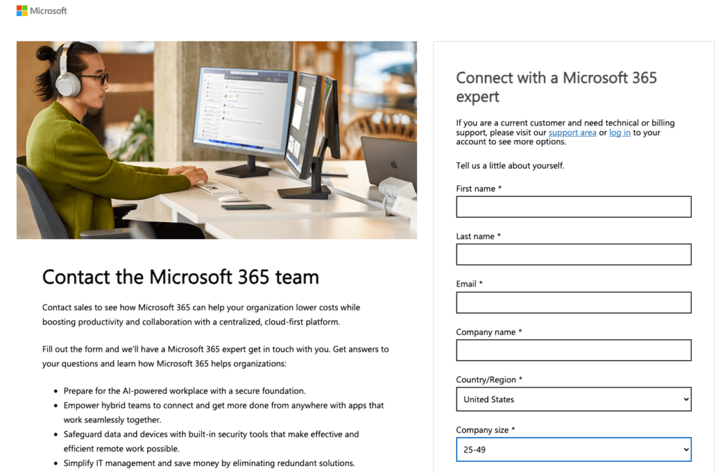
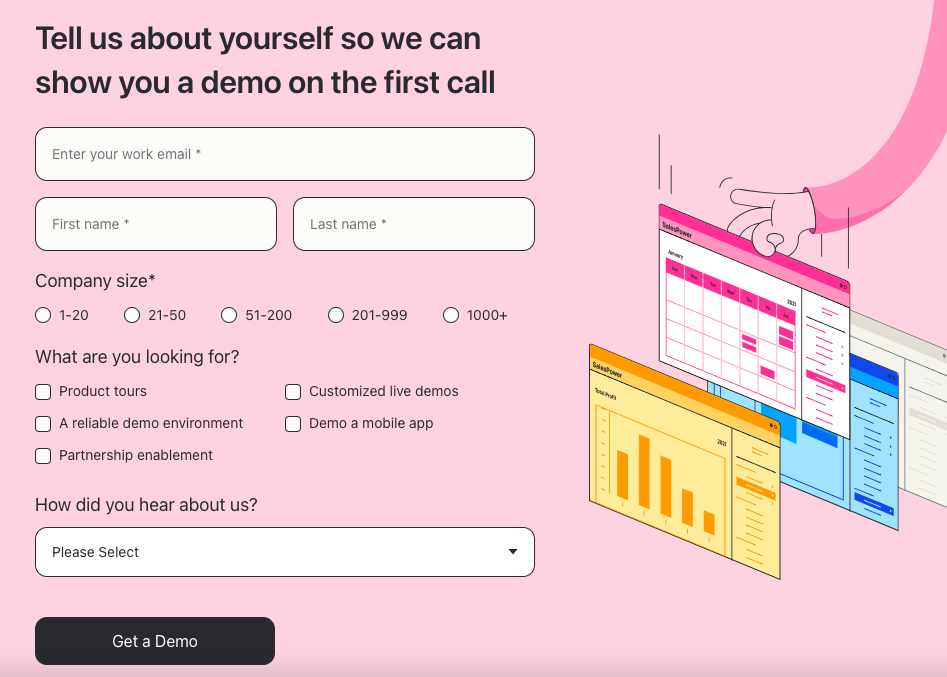
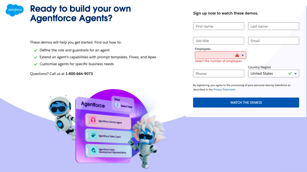
A contact form is an online form embedded on a website that allows visitors to easily communicate with the business or organization. Contact forms serve as a bridge between users and website owners, facilitating a variety of purposes such as requesting information, submitting inquiries, or providing feedback.
While email links can also be used for direct communication, contact forms offer distinct advantages. Not only do they streamline communication by structuring the way information is collected, but they also allow businesses to capture specific data from their visitors in a controlled manner.
For example, instead of a vague email, a contact form can require visitors to provide their name, email, and a detailed message or question, ensuring that communication is more efficient and organized from the start of the customer interaction.
Beyond functionality, contact forms can also be designed to stand out visually, aligning with the website’s branding and encouraging engagement.

Why Use a Contact Form Template?
While it’s possible to create a custom contact form from scratch, using a template offers many advantages. Contact form templates are pre-designed, easy to implement, and can often be customized to suit specific needs. Here are some reasons why using a contact form template is the way to go:
- Time-Saving: Pre-built templates mean you don’t have to design and code the form yourself. Most templates are ready to use with minimal adjustments.
- Customization Options: Even though these templates are pre-made, they often allow for a high degree of customization. You can tailor them to match your brand’s colors, fonts, and style, while also selecting the fields that suit your specific purpose.
- Optimized for Usability: Templates are typically designed with usability in mind, ensuring that your forms are intuitive and easy for users to complete.
- Mobile Responsiveness: With the rise of mobile browsing, it’s crucial that your contact forms are mobile-friendly. Most templates are designed to be responsive, adapting to different screen sizes seamlessly.
- Security Features: Many templates come equipped with built-in security measures, such as CAPTCHA or reCAPTCHA, to help prevent spam submissions.
Templates provide a solid foundation, ensuring that your form is both functional and visually appealing from the get-go.
Where Can I Find Contact Form Templates?
Many platforms offer a variety of contact form templates that cater to different needs. Below are some popular and versatile options that you can customize to your needs:
SurveyMonkey
SurveyMonkey, known for its powerful survey tools, also offers contact form templates that can be customized for different purposes. SurveyMonkey’s forms are particularly suited for businesses that want to collect structured information from users. Their drag-and-drop interface makes it simple to add or remove fields, and their forms can be easily integrated into your site for website visitors to use. No coding required!
Additionally, SurveyMonkey provides analytics, so you can track form submissions and gather data on user behavior, helping you make informed decisions about adjustments to your form.
Jotform
Jotform is another popular platform for creating contact forms to gather essential information. With an extensive template library, Jotform provides forms that can be used for anything from lead generation to customer feedback. The platform offers powerful customization features, including the ability to change the look and feel of the form, add logos, and even integrate it with third-party apps like CRMs or email marketing tools.
Jotform’s templates are designed to be mobile-responsive, making it easy for users to fill out forms on any device.
Cognito Forms
Cognito Forms is a robust and user-friendly form builder that allows users to create contact forms quickly. Its templates are highly customizable, offering advanced features like conditional logic, payment integration, and multi-page forms. This makes Cognito Forms ideal for businesses looking to create more complex contact forms without having to dive into coding.
The platform is known for its intuitive design interface and its ability to handle both simple and complex forms.
Typeform
Typeform is a bit different from traditional form builders in that it focuses on creating conversational forms. This unique approach makes the user experience more engaging, as it feels more like a conversation than a series of form fields. Typeform is particularly useful for businesses looking to enhance user interaction, offering sleek designs and an intuitive interface.
Their templates are highly customizable and can be tailored to suit a wide range of needs, from basic contact forms to in-depth surveys.
Contact Form Design Essential Tips
Creating an effective contact form isn’t just about adding fields for contact details and submitting a form. It’s about crafting a user experience that’s intuitive, efficient, and aligned with your business goals. Below are five essential tips to ensure your contact form design is optimized for both usability and conversions.
Tip 1: Keep It Simple
One of the biggest mistakes businesses make with contact forms is making them too complicated. The more fields you ask users to fill out, the less likely they are to complete the form. Stick to the essentials: name, email, and message for a responsive contact form. If you need additional information, consider adding it as an optional field to your simple contact form template.

Tip 2: Make It Mobile-Friendly
With more than half of internet traffic coming from mobile devices, it’s crucial that your contact form is mobile-optimized. Ensure that your form is responsive, meaning it adjusts automatically to fit different screen sizes. Fields should be large enough for users to tap comfortably, and any text should be legible on smaller screens.
Tip 3: Use Clear Labels and Placeholder Text
Avoid confusion by using clear, concise labels for each field. Placeholder text within form fields can also guide users on what to enter, such as “Enter your email address” or “Write your message here.” Make sure users understand what information you’re asking for, and avoid any ambiguity in your labels.
Tip 4: Include a Strong Call to Action
The button users click to submit the form is a critical element of your contact form designs. Instead of using a generic “Submit” button, consider using a more action-oriented phrase that aligns with your goal. For example, if your contact form is for lead generation, try “Get in Touch” or “Request a Quote.”

Tip 5: Provide Confirmation
Once users submit the form, make sure to include a confirmation message or redirect them to a confirmation page. This assures them that their message has been received and lets them know what to expect next, whether it’s a follow-up email or a phone call.
Using Contact Forms for Conversions
A well-designed contact form can be one of the most powerful tools for driving conversions on your website. But how exactly can a contact form boost conversions? It comes down to reducing friction, making it easy for potential clients or customers to reach out, and gathering the right information to move them further down the funnel.
To maximize conversions, consider the following strategies:
- Strategic Placement: Your contact form should be easy to find. Whether it’s embedded on your homepage, in your navigation menu, or as a pop-up, ensure that users don’t have to search for it. Place the form on high-traffic pages, such as landing pages or product pages, where users are more likely to convert.
- Tailor the Form to Your Audience: Different audiences have different needs. A simple form may work for basic inquiries, but if you’re targeting high-value clients, you may need to gather more detailed information. Make sure your form fields reflect the specific information needed to follow up effectively.
- Offer Incentives: Encourage users to fill out your form by offering a lead magnet, such as a free ebook, discount code, or exclusive content. Incentives can significantly boost your form’s conversion rate by providing immediate value to the user.
- Test and Optimize: Regularly test your contact form to see what works and what doesn’t. Use A/B testing to experiment with different layouts, form fields, and CTAs to see which version drives the most conversions.
Contact Form Best Practices
When it comes to designing contact forms, there are some universal best practices that every business should follow for more conversions. These ensure that your form is accessible, user-friendly, and effective in achieving its intended purpose.

1. Limit Required Fields
Requiring too much information can be a major turn-off for users. Limit the number of required fields to just what is necessary. Optional fields can still be included for those who wish to provide more details, but avoid making everything mandatory.
2. Include an Auto-Reply or Confirmation Email
After a user submits a form, send an auto-reply email confirming receipt. This reassures the user that their message has been received and outlines what will happen next. It’s also a great opportunity to thank them for reaching out and direct them to any further resources they may find helpful.
3. Ensure Accessibility
Designing your form with accessibility in mind is essential. This means ensuring that all users, including those with disabilities, can easily navigate and complete the form. Use labels and fieldsets that are readable by screen readers, and avoid using CAPTCHA methods that are difficult for people with visual impairments to pass.
4. Use Validation to Avoid Errors
Form validation helps prevent users from submitting incomplete or incorrect information. For example, if you’re asking for an email address, use validation to ensure the entered data follows the correct email format. This improves data accuracy and reduces user frustration.
Contact Elevato for Digital Marketing Services
In today’s digital landscape, having a well-designed contact form can make a significant difference in how you engage with visitors and convert leads. From selecting the right template to optimizing the design for conversions, contact forms are an essential tool for any business’s online presence. By following the tips and best practices outlined in this guide, you’ll be well on your way to creating an effective contact form that enhances user experience and drives results.
At Elevato, we specialize in helping businesses optimize their digital marketing strategies. Whether it’s designing user-friendly contact forms or developing a full-fledged digital marketing campaign, our team of experts is here to help. Contact us today to learn more about how we can support your business growth and drive more qualified leads.
